CI
- HOME
- INTRODUCTION
- CI
Word Mark

This word mark is composed of two rectangles and the English notation of Hansol, which expresses Hansol's will to realize the world's best company through diversification and internationalization. This rectangle shows Hansol's basic posture that connects nature and humans. The blue above represents heaven and the future of mankind, and the green below means earth, nature, and the present. This is Hansol's will to play the role of stepping stone in advancing from the unfinished land, nature, and present to the ideal of heaven, mankind, and the future.
Logo Type
Logo type is a basic element of CI along with Wordmark and is a symbol that visually embodies corporate image. It is used to assist the company's wordmark as an expression of a responsible company that creates trust and credibility, such as an individual's seal. This logotype is designed to highlight Hansol's friendly image and harmonize with Wordmark, and there are two types of Korean and English characters.
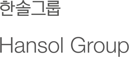
- Korean Logo Type
- In order to differentiate the Korean logotype from Wordmark, we avoided Heavy Type and developed the Korean secondhand style of Light Type as the basis. The use of a clear logotype is a symbol of the correct delivery and trust of the corporate image, so should be careful not to misuse it and take thorough management to prevent it from being visually altered when regenerating.
- English Logo Type
- The English logotype is Helvetica Neue Light type, which ontrasts with the Heavy type font used in Hansol's Wordmark, highlighting the Wordmark and the light font that can act as a logo type is applied.